
Today the 2009 F1 cars from Renault and Williams were announced and immediately became the extremes of livery design. The Renault R29 is a garish combination of white, yellow, orange and red, whereas the Williams appeared in an interim color scheme of midnight blue. Reaction has been predictably horrified at Renault's awful solution to their problem of clashing sponsor colors and universal approval of Williams' quiet but dramatic single color.
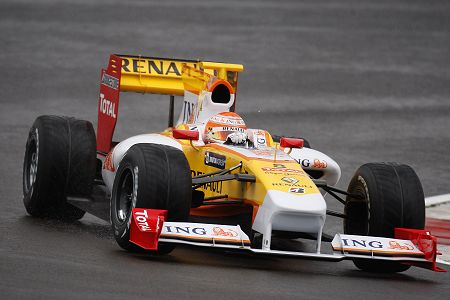
Renault R29 on test
That first impression is not helped by the fact that the R29 is the ugliest of the new cars anyway. The nose is unusually blunt and broad and this is compounded by a curious construction immediately beneath it. Some aerodynamic tweak may have demanded this but it looks as streamilned as a brick. The Renault is also the first design to have retained the rear fin, perhaps as advertising space, and the car ends up looking like a mobile billboard.
Last year I sympathized with the designer's task of somehow uniting so many colors into a reasonably tasteful whole and it was difficult to see how he could have done better; we became used to the R28 in time and its livery was eventually accepted by the fans. But the design this year is terrible, the yellow and orange clumsily handled in silly stripes, the white serving to emphasize the awkward nose and the red bits looking like replacements found in a junkyard.
This time there can be no excuse. In 2008, it was understandably difficult to make white, yellow, orange and blue live happily together - there should be no difficulty in harmonizing such related colors as yellow, orange and red on a white background this year. The fact that the mirrors are unnecessarily red tells me that little thought has gone into integrating Total's required color; the designer has just thrown everything together in the vague hope that we'd get used to it.
The fact that the Williams is the diametric opposite in livery design is entirely due to the fact that this no-nonsense team has waited to reveal its ultimate color scheme. The plain fact is that any car looks best in one shade only with advertising reduced to highlights in a contrasting color. There is no reason why the corporate colors of the sponsors should be allowed to take over the entire car; certain areas of the car are sold to the sponsors and they should be limited to those. Perhaps the Renault designer should consider how Ferrari manages the problem - Ferraris are always red and advertisers have to conform to that fact.
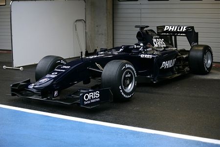
Williams FW31 outside the garage
The Williams FW31 is a pretty car anyway, adhering closely to the rules and a clean and pure shape as a result. As with last year's offering, it is hard to see how the final livery can be any better than its present dark and unfussy appearance. If looks were the deciding factor, the FW31 would be up there at the front, competing for race wins.
Unfortunately, the old adage that what looks right, is right, is no longer true. Last year the multi-colored Renault had the legs of the sober Williams and is likely to do so again this season. In the end, color and style do not matter and it was only coincidence that the awful earthdream Hondas were such bad performers on the track.
Looks matter to us, the fans, of course, and it must be hard to continue one's support for a team that produces a truly ugly livery. And that is one reason why I hope the BMW guys retain their sanity and have nothing to do with the alternative livery suggested by Bruno Mantovani, as pointed at by F1 Fanatic in the article "Can you make 2009 F1 cars look good?". You might fancy having a bash at that one - go on, I dare you!